Cottagecore Paint Palette — Sherwin-Williams
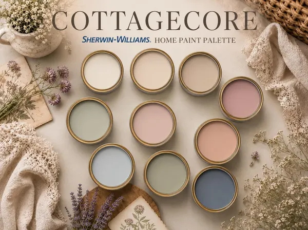
A 100+ page digital bundle with 9 coordinating Sherwin-Williams colors, a complete paint guide and a project planner.
$16.00View Palette
Sherwin-Williams · Timeless & Classic
$16.00
A 100+ page digital bundle with 9 coordinating Sherwin-Williams colors, a complete paint guide and a project planner.
Secure checkout by Stripe. Digital download, delivered within 24 hours.
Checkout for this palette is being set up. Email us to be notified.
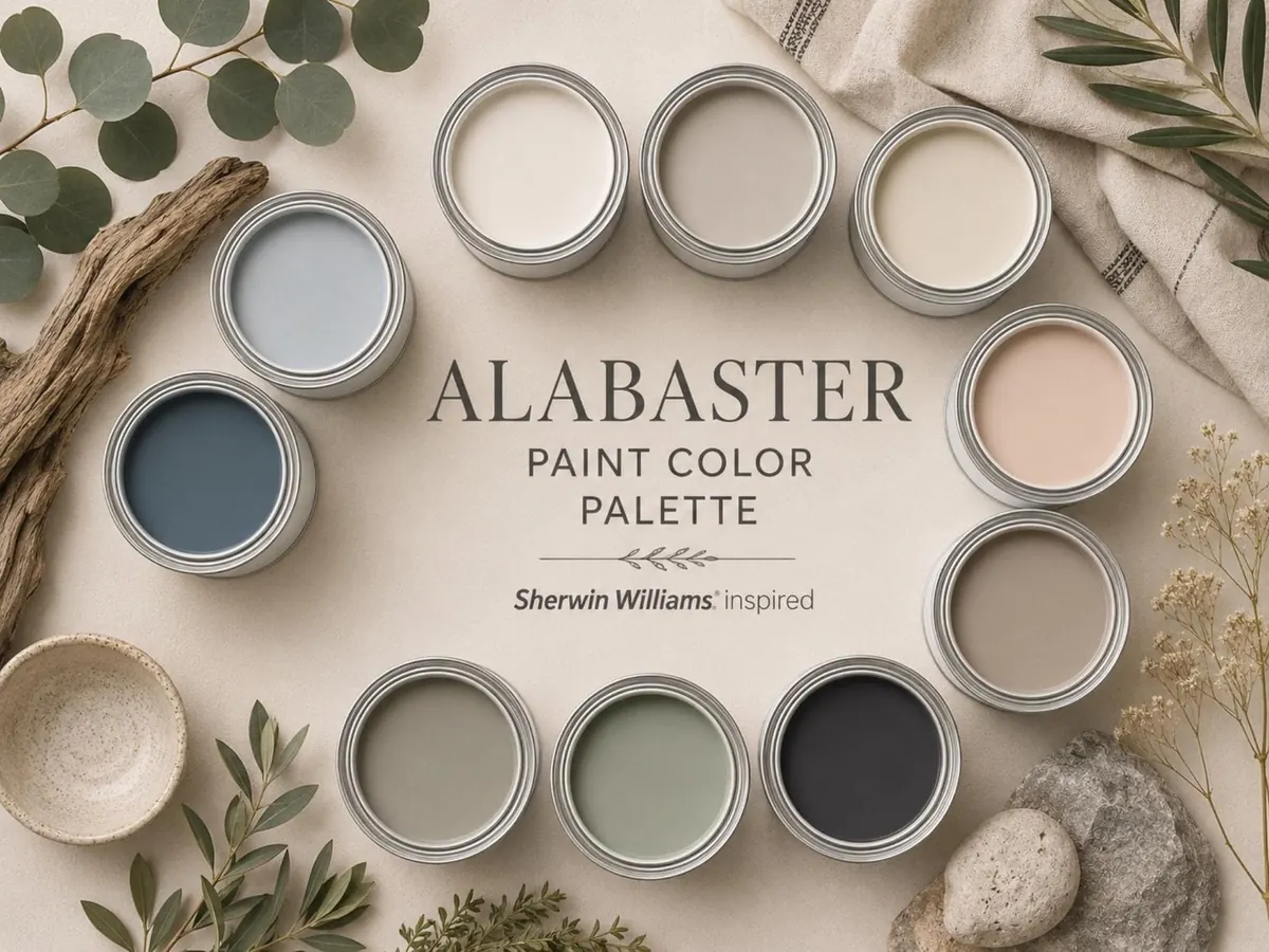
ALABASTER PAINT COLOR PALETTE is a 100+ page digital bundle featuring 9 carefully curated Sherwin Williams inspired colors designed to help you create a bright, calm, and beautifully coordinated home interior.
This bundle includes a complete palette guide, a detailed paint guide, and a practical project planner, giving you everything you need to confidently plan your next decorating or painting project.
Instead of comparing endless paint samples and second-guessing undertones, you receive a professionally curated collection of colors designed to work beautifully together throughout your home. Create interiors that feel airy, balanced, timeless, and effortlessly elegant.
Digital download. Three PDF files, 100+ pages in total. Nothing is shipped.
Alabaster-centered palettes have a timeless quality that feels both fresh and inviting. Soft whites, warm greiges, earthy taupes, muted blues, and nature-inspired greens create interiors that feel bright without being cold and sophisticated without feeling formal. These shades reflect natural light beautifully, enhance architectural details, and create a seamless flow from room to room. Because the palette balances warm and cool influences, it adapts effortlessly to farmhouse, cottage, coastal, transitional, and modern interiors.
Colors may look different on screen than on your walls, so always test physical samples first. Sherwin-Williams and its color names are trademarks of their owners; this independent guide is not affiliated with or endorsed by them.
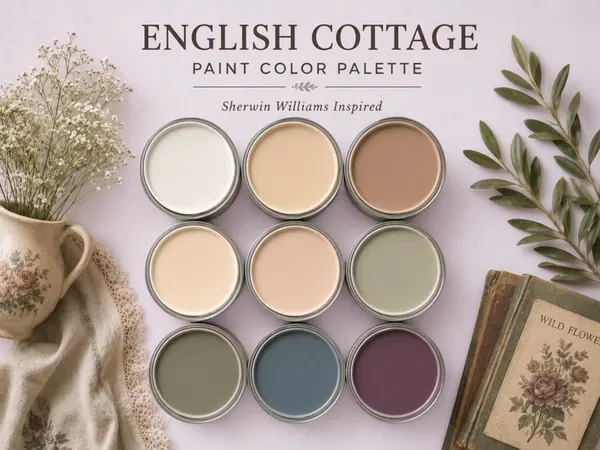
A 100+ page digital bundle with 9 coordinating Sherwin-Williams colors, a complete paint guide and a project planner.
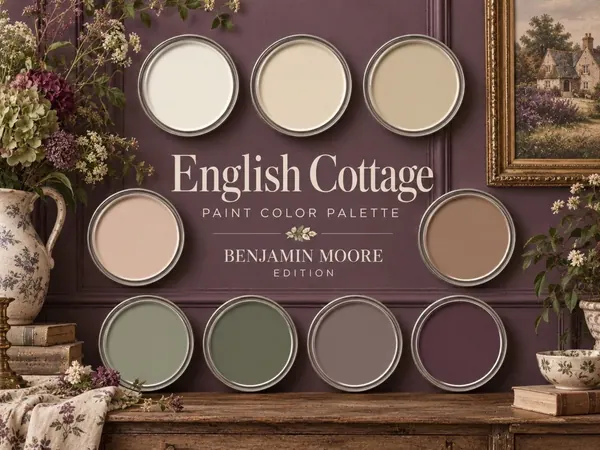
A 100+ page digital bundle with 9 coordinating Benjamin Moore colors, a complete paint guide and a project planner.
A 100+ page digital bundle with 9 coordinating Sherwin-Williams colors, a complete paint guide and a project planner.
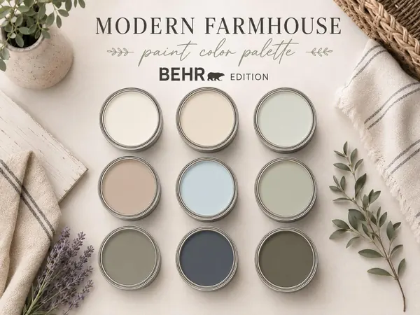
A 100+ page digital bundle with 9 coordinating Behr colors, a complete paint guide and a project planner.