Mid Century Modern Paint Palette — Benjamin Moore
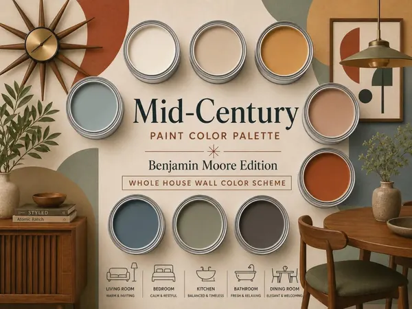
A 100+ page digital bundle with 9 coordinating Benjamin Moore colors, a complete paint guide and a project planner.
$16.00View Palette
Sherwin-Williams · Modern & Minimal
$14.00
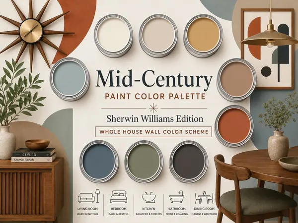
A 100+ page digital bundle with 9 coordinating Sherwin-Williams colors, a complete paint guide and a project planner.
Secure checkout by Stripe. Digital download, delivered within 24 hours.
Checkout for this palette is being set up. Email us to be notified.
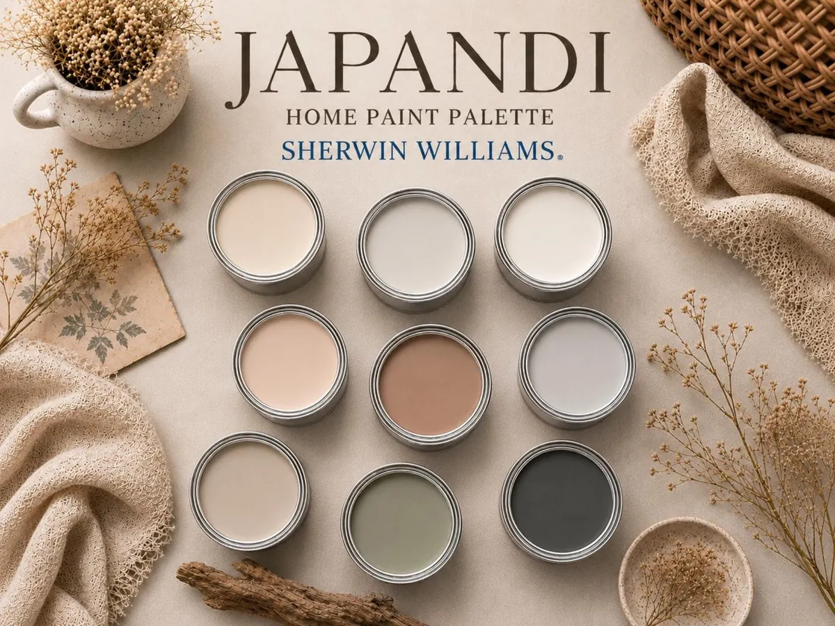
Japandi Paint Color Palette is a 100+ page digital bundle featuring 9 carefully curated Sherwin Williams paint colors designed to help you create a calm, balanced, and beautifully coordinated home interior.
This bundle includes a complete color palette guide, a detailed paint guide, and a practical paint project planner, giving you everything you need to confidently plan your painting project.
Instead of comparing endless paint samples and second-guessing undertones, you receive a professionally curated palette inspired by Japandi design principles and created to work beautifully together throughout your home.
Create interiors that feel peaceful, warm, timeless, and effortlessly refined.
Digital download. Three PDF files, 100+ pages in total. Nothing is shipped.
A Japandi paint palette works because it captures a calm, balanced mood without feeling cold or overly minimal. Warm whites, soft greiges, muted clay, stone gray, olive green, and charcoal reflect natural elements like plaster, wood, ceramic, and foliage, so everything feels intentional. These colors handle light beautifully, making rooms feel airy yet cozy, while earthy undertones keep the space from feeling flat. The beauty is in the restraint—each shade blends quietly, creating a peaceful, layered atmosphere that feels effortless.
This palette also works because of its simplicity and timeless versatility. The mix of soft whites, warm neutrals, blush, gray, olive green, and charcoal allows bright and moody rooms to feel connected. Each tone pairs naturally with oak, linen, stone, and black finishes, so the design feels cohesive rather than forced. It adapts to modern homes while maintaining a calm look. The result feels curated yet comfortable, giving your home a serene, inviting presence.
Colors may look different on screen than on your walls, so always test physical samples first. Sherwin-Williams and its color names are trademarks of their owners; this independent guide is not affiliated with or endorsed by them.
A 100+ page digital bundle with 9 coordinating Benjamin Moore colors, a complete paint guide and a project planner.
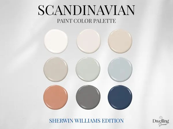
A 100+ page digital bundle with 9 coordinating Sherwin-Williams colors, a complete paint guide and a project planner.
A 100+ page digital bundle with 9 coordinating Sherwin-Williams colors, a complete paint guide and a project planner.
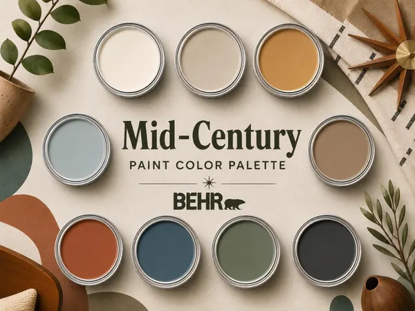
A 100+ page digital bundle with 9 coordinating Behr colors, a complete paint guide and a project planner.