Cozy Neutral Paint Palette — Behr
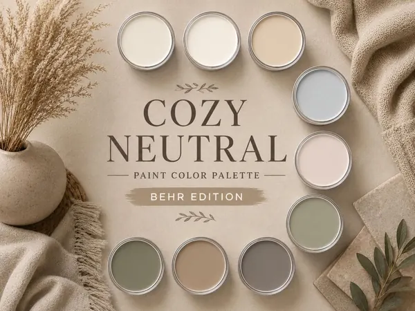
A 100+ page digital bundle with 9 coordinating Behr colors, a complete paint guide and a project planner.
$16.00View Palette
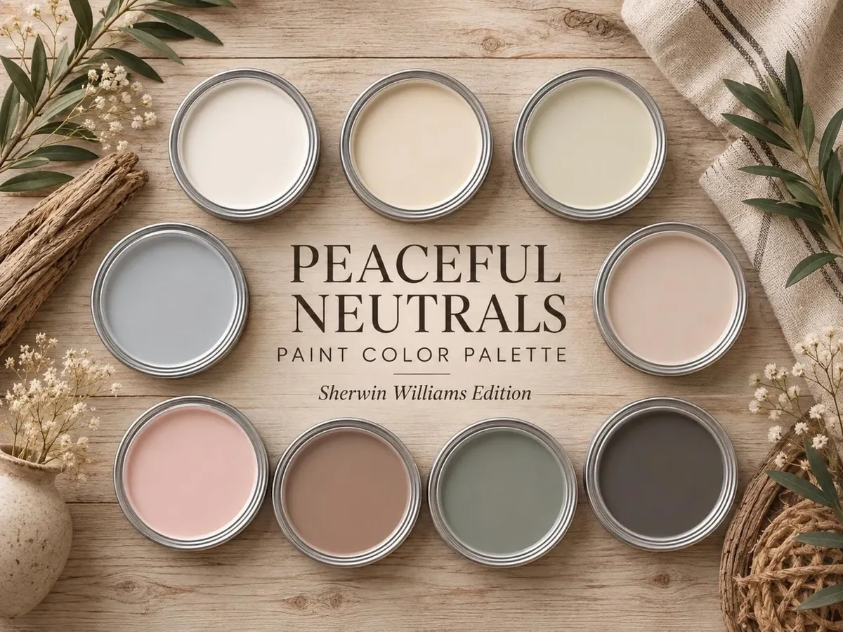
Sherwin-Williams · Cozy Neutrals
$16.00
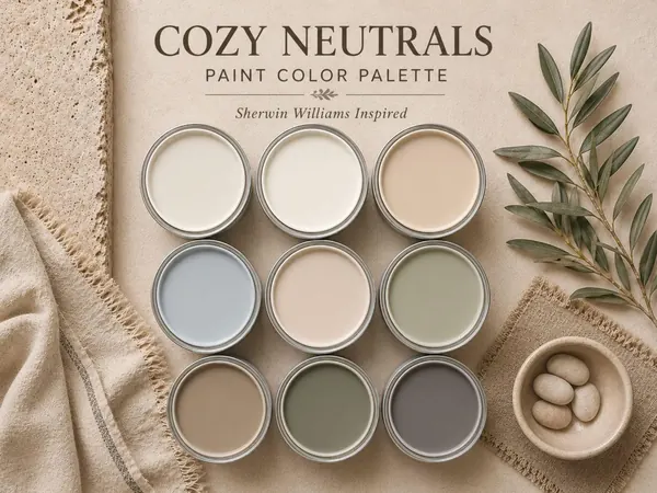
A 100+ page digital bundle with 9 coordinating Sherwin-Williams colors, a complete paint guide and a project planner.
Secure checkout by Stripe. Digital download, delivered within 24 hours.
Checkout for this palette is being set up. Email us to be notified.
Create a home that feels calm, cozy, timeless, and beautifully lived-in with this Peaceful Neutrals Paint Color Palette — Sherwin Williams Edition.
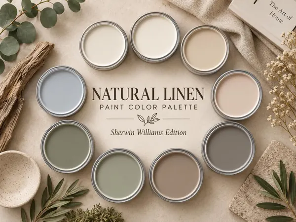
This 100+ page digital paint bundle features 9 carefully curated Sherwin Williams paint colors selected to work beautifully together throughout your home. The palette combines soft creamy whites, warm beiges, muted blush tones, earthy taupes, gentle sage, soft blue-gray, and a rich deep neutral to create a peaceful, sophisticated, and cozy interior feeling.
Whether you're decorating a living room, dining room, bedroom, kitchen, bathroom, entryway, home office, or hallway, this palette makes it easier to choose colors that flow naturally from one space to another.
Instead of buying dozens of paint samples and wondering which colors actually work together, you'll have a complete, organized palette to help you plan your home with confidence.
Think warm natural textures, soft linen, light wood, cozy textiles, organic materials, understated elegance, and rooms that feel peaceful without feeling boring.
Digital download. Three PDF files, 100+ pages in total. Nothing is shipped.
LIVING ROOM
Create a cozy and welcoming living room with warm neutral walls, natural textures, light wood, soft upholstery, and layered textiles.
The creamy whites and gentle neutrals work beautifully as main wall colors, while deeper taupes, sage, and charcoal-inspired tones can add contrast through furniture, cabinetry, accent walls, or decorative elements.
DINING ROOM
Create an elegant and relaxed dining room with warm neutral walls, natural wood, woven textures, soft lighting, and understated decorative details.
Use a deeper shade to create a more intimate backdrop or keep the walls light for an airy, sophisticated feeling.
BEDROOM
Create a peaceful bedroom with soft neutrals, warm beige tones, muted blush, gentle greens, and natural materials.
These colors work beautifully with linen bedding, cozy textiles, light wood, woven accents, and soft layered textures.
KITCHEN
Bring a warm and timeless feeling into your kitchen with creamy walls, neutral cabinetry, muted green accents, natural wood, stone surfaces, and understated hardware.
The deeper colors can also work beautifully on kitchen islands or lower cabinetry when you want a little more contrast.
BATHROOM
Soft cream, beige, blush, sage, and blue-gray tones can create a calm bathroom that feels warm, inviting, and timeless.
Pair the colors with natural stone, wood, brushed metals, linen, and simple accessories for a relaxed look.
ENTRYWAY & HALLWAY
Use the palette to create a welcoming entryway or hallway that connects the different rooms of your home.
A consistent color story helps your entire house feel more intentional and cohesive.
HOME OFFICE
Create a comfortable home office with warm neutral walls, natural wood, soft textiles, greenery, and deeper accent colors.
The palette works beautifully for both minimal and more layered interiors.
🎨 COMPLETE PAINT GUIDE
30+ Pages
Choosing a paint color isn't just about picking the prettiest swatch.
Lighting, room orientation, sheen, surrounding colors, flooring, furniture, and even the time of day can completely change how a color looks.
This guide helps you understand the basics before you start painting.
Inside you'll learn about:
• Paint fundamentals • Different types of interior paint • Paint sheen levels • Understanding LRV • How natural light changes paint colors • How room direction affects color perception • Warm vs. cool undertones • Creating color balance • Choosing accent wall colors • Planning a cohesive whole-home palette • Step-by-step painting guidance • How to calculate the amount of paint needed
The goal is to help you move beyond simply choosing a color you like and understand why certain colors work together in a room.
📋 PAINT PROJECT PLANNER
Turn your inspiration into an organized painting project with the included Paint Project Planner.
Planner pages include:
• Paint sampling planner • Room paint tracking sheets • Color comparison pages • Morning / afternoon / evening wall test tracker • Paint quantity calculator • Wall measurement planner • Final color decision page • Notes and planning pages
Use the planner to compare samples, record your choices, measure rooms, and keep your entire painting project organized.
🕯️ PERFECT FOR THESE INTERIOR STYLES
This palette can work beautifully with a variety of decorating styles, including:
• Warm minimalism • Organic modern • Scandinavian interiors • Japandi interiors • Modern farmhouse • Neutral interiors • Contemporary interiors • Traditional interiors • Cozy interiors • Rustic interiors • Modern classic • European-inspired interiors • Transitional interiors • Organic interiors
The combination of creamy whites, warm neutrals, muted colors, earthy tones, and deeper shades gives you plenty of flexibility to make the palette feel light and airy or warm and cozy depending on your furniture, lighting, and styling.
🌸 WHY PEACEFUL NEUTRALS WORK
Neutral interiors don't have to feel plain or boring.
The right combination of warm whites, soft beiges, earthy taupes, muted greens, subtle blush, blue-gray, and deeper neutrals can create a home that feels layered, comfortable, and full of personality.
Warm creamy shades create a soft foundation. Beige and taupe tones add warmth and depth. Muted colors bring subtle character, while deeper shades create contrast and definition.
This palette was created around that idea.
The colors can be mixed throughout your home while still maintaining a cohesive overall color story.
Colors may look different on screen than on your walls, so always test physical samples first. Sherwin-Williams and its color names are trademarks of their owners; this independent guide is not affiliated with or endorsed by them.
A 100+ page digital bundle with 9 coordinating Behr colors, a complete paint guide and a project planner.
A 100+ page digital bundle with 9 coordinating Sherwin-Williams colors, a complete paint guide and a project planner.
A 100+ page digital bundle with 9 coordinating Sherwin-Williams colors, a complete paint guide and a project planner.
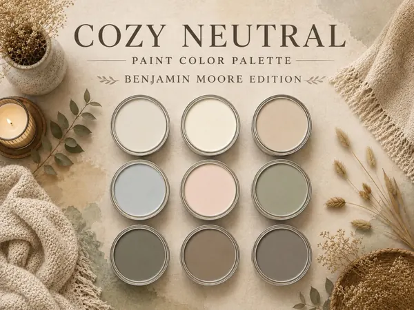
A 100+ page digital bundle with 9 coordinating Benjamin Moore colors, a complete paint guide and a project planner.